ESPN Ending Syndicated Version of ‘Good Morning Football’
Super Bowl logos are always an important part of the iconography of the NFL’s biggest game—visuals that define each event’s branding and can even color the mood around the game itself.
The logos can represent the identities of the host cities, spark conspiracy theories, and function as major commercial opportunities. Fans care enough to debate the designs themselves: One decade-long template can be nostalgically referred to as a golden age, while a recent shift can be called corporate and soulless.
Each year, the newest design is stamped on media events and guides, used by official sponsors and advertisers, and sewn and printed onto a variety of merchandise—at higher price points, of course. A 2024 men’s Travis Kelce jersey (Nike “Game” edition) retails on Fanatics for $129.99. With the Super Bowl LIX patch on the right chest, the price jumps to $149.99. An Eagles player T-shirt goes for $39.99 without the SBLIX logo and $49.99 with one.
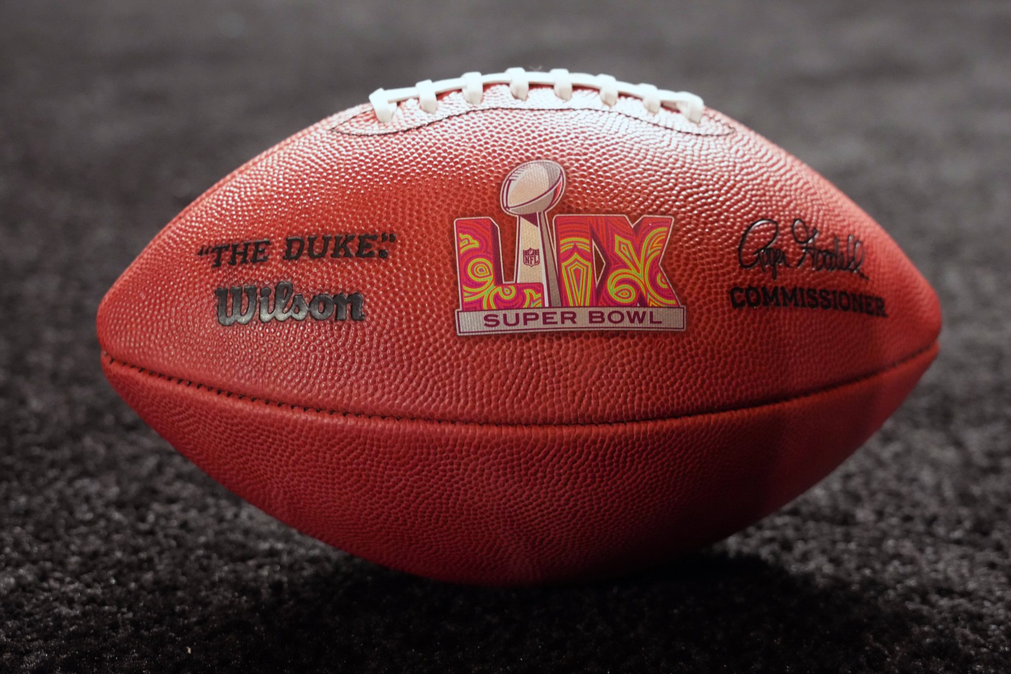
This year, for Super Bowl LIX, the logo has a similar layout to the one the NFL has used since 2017: A silver Lombardi Trophy runs through the middle of the Roman numerals, all of which sit atop a horizontal bar reading “Super Bowl.” But as the Big Game returns to New Orleans, the logo is also markedly different.
For the first time, the NFL worked with a local artist to design the logo. Tahj Williams of Louisiana’s Black Masking Indian Tribe created the mark using traditional beading techniques. (The NFL said Williams “painstakingly built” this year’s logo due to the complex method.) The Roman numerals are bright red with curling lime green, dark red, and gold fleur-de-lis designs.
Since 2021, Roman numerals have been filled with city-inspired colors and designs: Los Angeles’s Super Bowl LVI logo featured orange numerals with palm trees; Arizona’s Super Bowl LVII logo included purple and red canyons beneath a blue-green sky; and the Super Bowl LVIII logo was purple and pink featuring the Las Vegas Strip.
But Williams’s design within those numerals is the most artistic since the league first introduced the silver color scheme and Lombardi Trophy in 2011. The 2025 design is a departure from two-tone landscapes and cityscapes. Just like the Mardi Gras–inspired Super Bowl XXXI logo, it’s a design that immediately invokes New Orleans by tapping into the city’s well-known culture, not its monuments or topography.
For most of the event’s history, Super Bowl logos have toyed with different fonts, designs, and colors. What looked in the early days as something like experiments with Microsoft Word’s “WordArt” slid into a consistent red, white, and blue color palette starting in the 1980s, albeit with a plethora of creative designs. Super Bowl XXVII’s logo inspired by the Rose Bowl is one for the history books.
bring back cool super bowl logos pic.twitter.com/a0HKqK8rPZ
— Max Nathanson (@mdnate9) January 27, 2025
More city-inspired designs followed in the 1990s and 2000s, like a Georgia peach in Atlanta, an Aztec-inspired design in Arizona, the aforementioned Mardi Gras logo, a space-themed design in Houston, and more. These logos varied in color, shape, and size, with the Roman numerals prominently featured but never arranged the same way. Designs often evoked a sense of motion, whether incorporated into the landscape like waves under a bridge in Super Bowl XXXIX or simply stretching or angling the font.
For the first Super Bowl after the September 11, 2001 attacks, which was also held in New Orleans, the original fleur-de-lis design was replaced with a logo featuring a map of the U.S. in the pattern of an American flag. That logo was one of several with a primary design encircled by details of the game including the date and location.
Super Bowl XXXVI (2002)
— Logos That Go Hard (@LogosThatGoHard) February 12, 2023
Submitted by: @GeoffJMags pic.twitter.com/QnEvRiJK81
In 2011, the motion, the colors, and the creativity came to a halt. That year was the first of the silver Lombardi Trophy logos, featured above all text. A massive golden “50” appeared on the 2016 Super Bowl logo (the league wasn’t into “Super Bowl L”), then the NFL switched to the layout it has used ever since, with numerals flanking both sides of the Lombardi Trophy, with a mostly or partially silver design.
This year’s logo marks a return to the creativity of the Super Bowl’s best logos with its color, history, and local connection. Yet unfortunately for the 2025 logo, it’s being discussed online less for its design, and more as the subject of a conspiracy theory connecting the colors of the Super Bowl logo to those of its two teams—a coincidence in three of the past four years. The red and green of the Chiefs and Eagles match perfectly with Williams’s design.
Still, the Super Bowl LIX logo is the most creative and instantly identifiable logo the NFL has used since the 2010 game, and perhaps signals a shift to nostalgic fans that the league could be launching back into the artistry of years past.