By: Meaghan McCloskey, @Meaghan_Mc3
College basketball season is officially upon us, which means team posters are being revealed. Like football, basketball posters are a great way to show school pride and provide a fun way to display the schedule. Poster Swag once again gathered posters from colleges to show off the creativity of marketing departments and give people the chance to see posters they wouldn’t normally have the chance of seeing.
I’ve ranked my 10 favorites on the following criteria:
· Creativity
· Visual Appeal
· Clarity of school and schedule
Keep reading to see who took home the #1 spot!
*All poster images are from Poster Swag.
*Not all school posters were released at the time of this ranking.
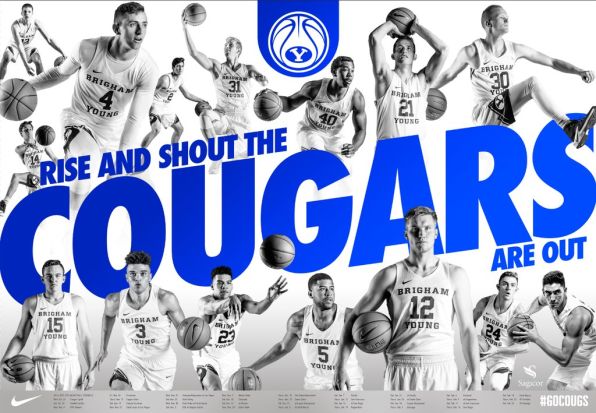
10 — BYU

The bright blue lettering on a neutral background really grabs your eye and keeps your attention.
9 — Arizona

Using caricatures of the team instead of regular pictures is a great way to differentiate from other posters.
8 — Kentucky

This is one of three posters with the same layout, but rotates the two featured players. I like the simplicity and focus on the players.
7 — Maryland

One of three options, I like that Maryland featured a crowd-favorite play in the backwards two-handed dunk. The layout is simple but still gets your attention.
6 — Michigan

Michigan did a really good job with the color scheme and keeping it simple. Not to mention just looking at the player gets you excited for the season!
5 — Arkansas

I love that Arkansas broke down a dunk while allowing each player to add their own twist to the process. It’s the perfect pano-style poster.
4 — Michigan State

This is another great pano-style poster. The lime green lettering in the background adds an electric feel to an already exciting poster.
3 — Montana State

I love the simplicity of this poster. The fog/sky background is a great touch for the Big Sky Conference school and really allows you to focus on the player.
2 — Purdue

This is a great poster for a few reasons. First, I love that they have a dual-motto to help make their case as the best collegiate team in Indiana. Second, making it the shape of Indiana is a great way to stand out from other posters and put their motto into something physical. Third, having a player getting ready to dunk is brilliant because dunks are meant to make a statement. It’s one of three posters and each one has a player making a “statement” play.
1- Nebraska
https://twitter.com/HuskerHoops/status/797197474733682688
Nebraska just dropped the mic on posters everywhere. The glow-in-the-dark feature is brilliant. It’s hard to put into words how awesome this poster is, so I’ll let it do the talking.
Don’t see your favorite? Think they should’ve been ranked differently? Comment below or send me a tweet!
