By: Meaghan McCloskey, @Meaghan_Mc3
College football is a beautiful thing. It gives us an excuse to sit on our couches and not doing anything on Saturdays, unless you decide to root your team on in person. Other than sitting on my couch all day, one of my favorite things about college football is the team posters. I know I sound like a nerd, but I really appreciate a good team poster. I love seeing the creativity of marketing departments and how they choose to show off their team for some school pride swag.
Last week, @PosterSwag released their Top 50 posters, as voted on by Twitter followers, college athletics designers and their own rankings. This inspired me to do my own ranking using the following criteria: (1) ability to tell what school it is, (2) clarity of schedule, (3) slogan visibility (if applicable), and (4) overall appeal and “wow” factor. Check out my 15 favorite posters below and see how it compares to Poster Swag’s. Comment below with your favorites or ones you think should’ve made the list!
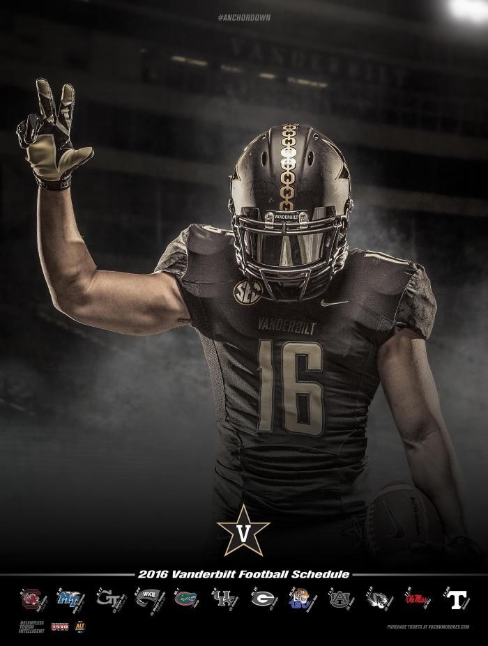
15. Vanderbilt:

Sometimes simple is the way to go. Vandy did a good job of intensifying a simple layout.
14. New Mexico State:

It’s hard to go wrong with a poster if you make it like a Topps Card.
13. Louisville:

The red unis really jump off the page, and, in turn, make the players look like they’re going to come after you.
12. Northwestern:

The color scheme is really cool, especially with the Chicago skyline at the bottom. Plus, the player pose is awesome.
11. TCU:

I love that they used a real horned frog and how they laid it out with the player.
10. Minnesota:

The in-game picture with a focus on the helmet is a really cool idea.
9. Eastern Michigan:

I really like the green/white balance and the prominence of “Let’s Roll.” Just looking at the poster gets me excited for football.
8. Maryland:

Making the player’s “Believe in Yourself” tattoo prominent is perfect for a sports poster. The white background lets you focus on the details like the image on the player’s jersey.
7. Rutgers:

They used just the right amount of brightness for the red, and the sword is really cool.
6. Purdue:

The parallelogram shape is a great idea and makes the moving players look even cooler.
5. Florida International:

I love the use of a team picture in the face mask and how the sides of the poster are lined like a football field.
4. Memphis:

The black background with neon blue is a fantastic look.
3. Colorado State:

The mix of old-timers and current players, with a vintage filter, is a great tribute to the field CSU will be saying goodbye to as they build a new stadium.
2. West Virginia:

Making the mountaineer silhouette stand out against a football player in the sky is really cool.
1. Washington:

A tribute to Prince that ties into a prominent Seattle characteristic? That’s marketing done right.
