HARTFORD — On a windy Jan. 11 evening, more than 10,000 fans packed the XL Center to celebrate the 50th anniversary of hockey in Hartford, Conn. The Whalers were the clear focus: Before puck drop for the AHL Wolf Pack game, players from the franchise were honored in a ceremony hosted by the Whalers’ radio voice, Chuck Kaiton.
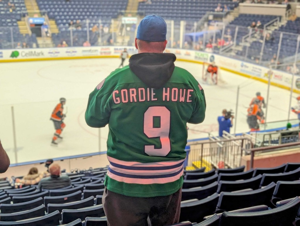
In the seats, it was a wall of green, blue, and white. Thousands of fans wore jerseys, sweatshirts, shirts, and hats in the Whalers’ iconic colorway. “Brass Bonanza” played to a roar.
It’s been more than a quarter century since the Whalers moved to Raleigh in 1997 to become the Carolina Hurricanes. And while the franchise’s gear was the unofficial dress code that night in Hartford, Whalers apparel is a staple of stadiums, streets, and stores far beyond the central Connecticut market that was ultimately too small to support the team.
“I grew up in Montréal, and I’ve seen it a little bit with the Expos—kind of classic colors, classic logo, but it’s still not even close to what I’ve been seeing with the Whalers,” says Tal Pinchevsky, who produced and directed the 50th-anniversary documentary The Whalers alongside Pat Pickens. “I went to Québec City with my family, and I found a sports store for tourists. And they primarily had on their racks Montréal Canadiens gear, [Québec] Nordiques gear, and Hartford Whalers gear.”
Retailers continue to satiate the unwavering commercial hunger. Vendors include the official Fanatics-powered NHL Shop, sports and culture brand ’47, and throwback-focused Mitchell & Ness. Vineyard Vines, known for its preppy apparel and accessories, also released a Whalers tote bag that retailed for about $100. There’s endless unlicensed and counterfeit gear floating around, too.
Bethany Davis, senior director of merchandise and retail with the Hurricanes, tells Front Office Sports its official Carolina Pro Shop has a relatively consistent drumbeat of demand for Whalers apparel. Volume peaks at around 20% of total sales leading up to the Hurricanes’ Whalers Night, during which the team wears the Hartford jersey on ice. Even beyond the themed game, however, Davis says they’ve also created a Whalers shop inside the Lenovo Center to satisfy the customers who ask for gear year-round. Online, they ship orders internationally, especially to Canada. (Other retailers declined to provide sales information or did not respond to requests from FOS.)
Tap, hold and load in 4k pic.twitter.com/37pYibMTqd
— ᴀʀᴅᴀ Öᴄᴀʟ (@Arda) January 14, 2025
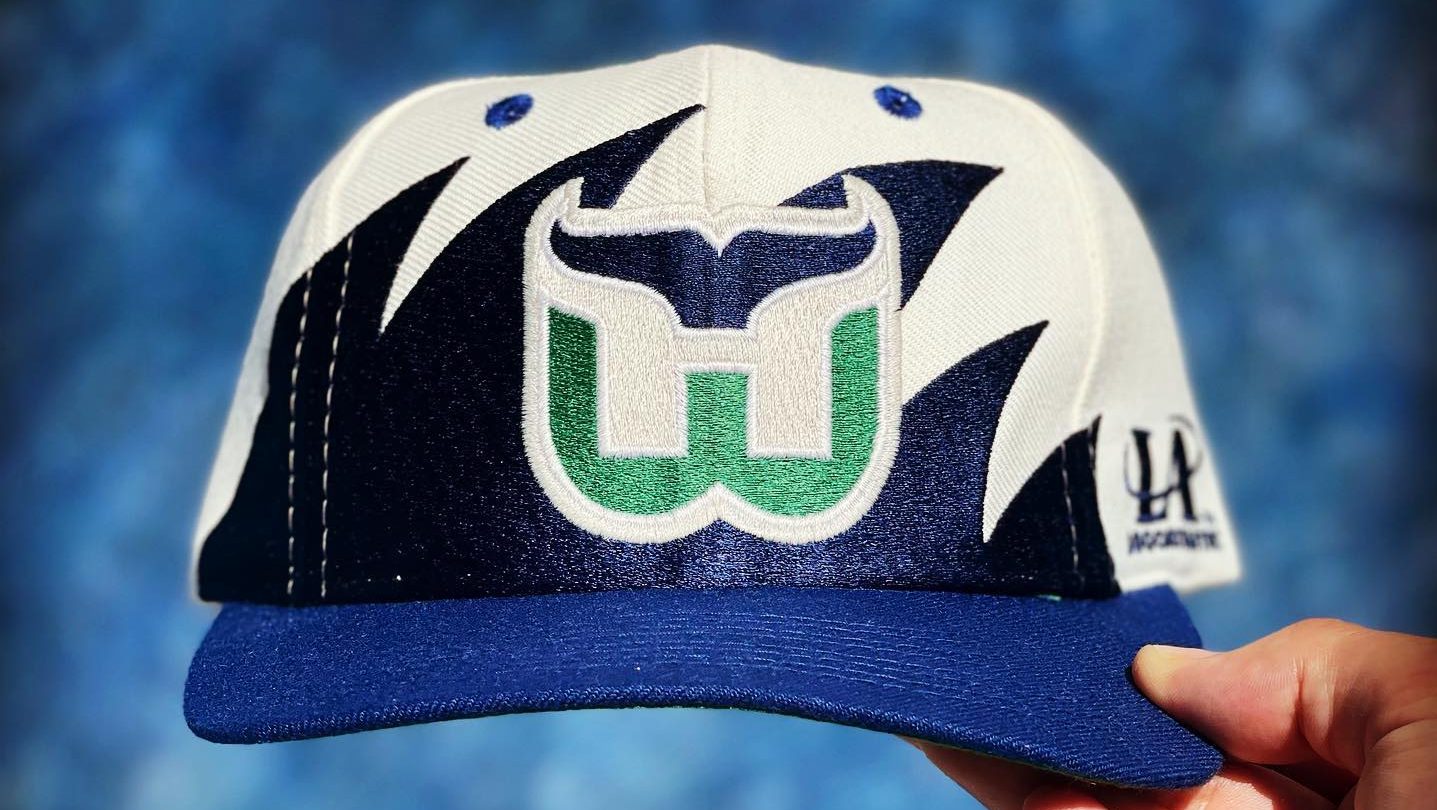
Most of the wide-ranging appeal and continued commercial viability of Whalers merch boils down to the logo. The iconic design was introduced in 1979 when the team joined the NHL: a blue whale tail above the letter “W,” with the negative space creating an “H.”
“The logo is probably one of the best-created marks in all of sports history. I would say it’s genius in its design,” Arda Öcal, a host of NHL on ESPN, tells FOS. Öcal moderated a post-screening panel at The Whalers documentary premiere in Hartford in a “New Whale Order” tee. (“I need that shirt,” replied one Threads user to his post about the event.)
The logo is technically brilliant but also intangibly magnetic—a pull that’s especially strong amid the current cultural obsession with the ’90s and 2000s, which is also driving a scramble for vintage sports merch.
Gen Zers who weren’t born during the franchise’s existence—and often don’t know Hartford’s long pro hockey history—snap up Whalers apparel as much as the fans who were there for the on-ice action. Pinchevsky and Öcal believe wearing the logo transcends the cool factor of any other defunct team’s mark; they say comparisons to similar-era teams including the Nordiques, Atlanta Flames, or Kansas City Scouts can’t even touch the Whalers’ cultural cred.
“It’s definitely an extension of this throwback industry that we’ve seen just absolutely explode in sports. So many of these old brands have started resurfacing, and a lot of companies have seen the opportunity to make money off it,” says Pinchevsky. “People like the old styles. They like the retro look, the retro colors. You can’t really find anything new that looks like that. … The Whalers are the ultimate throwback logo.”
Öcal agrees. “If I love all things ’80s and early ’90s and I’m wearing things from that era to go along with my Ninja Turtles shirt or my Street Fighter II arcade machine, wearing a Hartford Whalers shirt invokes a similar sense of happy chemicals and nostalgic sense in my brain,” he says. “It feels good and it takes me back.”
Pinchevsky tells FOS that even logo designer Peter Good, with whom he and Pickens got one of the last on-camera interviews before the artist’s death in 2023, couldn’t entirely nail down the reasons for its modern relevance. “Not only could he not explain exactly why it had resurfaced like this, but he wasn’t even aware that it was happening until people told him.”
The day after he’d shot for the documentary at Sacred Heart University in Connecticut, Pinchevsky found himself at a bank in New York City. “I turned around, and the guy right behind me was wearing a Whalers cap. And then I was watching this new Jerry Springer documentary on Netflix, and you can see someone in the crowd wearing a Whalers jersey,” he says. “I’ve been hearing stories of people who’ve seen it in Europe and South America—people don’t even know what it is, but they like the look and put it on.”
