Is the new logo too different from the old one?

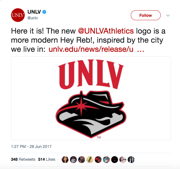
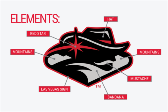
On June 28, University of Nevada Las Vegas released their new and “improved” logo. Above is a glimpse into the future of UNLV athletics.
To me, the logo is pretty anticlimactic and does not really say “hey” anything. The designers seemed to be going for a more modern, sleek look compared to their previous logo. However, UNLV’s latest seems to have had an exciting launch party, but it seems that it will soon get lost in logo space.
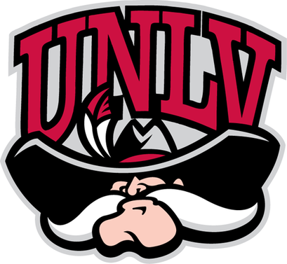
The previous logo was a little goofy, but it was distinct and memorable. I would recognize and remember that mustache anytime, anywhere. To me, the new logo is not really one that will catch my eye.
Mascots are a large part of fan experience for sports programs, whether it is the athletic logo being brought to life at promotional events to sell tickets or being plastered on a shirt to sell merchandise, the logos are vital.
If fans enjoy a team’s athletic logo or mascot, they are certainly more apt to represent the team. There are even some individuals I know who will go out to games or purchase merchandise from a team simply because of their classic logo.
Logos that tend to be successful are simple and to the point, full of personality, silly and out of the ordinary, or really embody the location.
Simple and to the point is one area where UNLV certainly went wrong. Representatives who designed the logo explained that the logo incorporates many elements of the state of Las Vegas, but unless you have an explanation, it is hard to pick out.
I’ll be honest, the only two things I really got out of the logo were the hat and the moustache, and that is because I was familiar with those two attributes on the old logo.
They were simple and stood out on the previous logo. If you look at a logo like Michigan’s “M”, Clemson’s paw print, or UNC’s letters — most sports fans can recognize them. The logos are simple, easy, and to the point, which is certainly valuable in a fast moving society like today’s.
Logos that are filled with personality are also generally successful. Some universities do a great job with bringing their logo to life through their mascot. The Oregon Ducks have done it right with sending the duck around making an “O” with its hands. Oregon even went as far as creating a uniform after the logo/mascot’s personality this year.
The Maryland Terrapins have their mighty terp in their logo, and you can see the terp’s personality immediately. Good old Sparty up in East Lansing has a peppy, macho personality that is a hit with Michigan State fans as well. Nothing gets the crowd amped up like some flexing from their strong Spartan of a mascot.
Some logos are silly and out of the ordinary, such as Georgia Tech’s fighting yellow jackets logo.
Finally, we can’t forget about the South Carolina Gamecocks, who are quite literally fighting chickens. The students love to sport their “Go Cocks” shirts; I usually have to do a double take at those shirts, and I always giggle.
Logos that tie in the location are also successful. Cattle is a staple of Texas, so the Longhorns did it right with their logo. The saying “hook em’ horns” really embodies the ranching state and the pride in the culture behind it.
The Florida Gators are perfect for the state of Florida and their abundant and unique population of alligators. The University of Florida was smart in creating some buzz about this cool aspect of their state.
Ohio State University plays big into being located in the buckeye state as the Ohio State Buckeyes. You will always catch Brutus Buckeye sporting an “O” with his arms to portray Ohio State’s athletic logo.
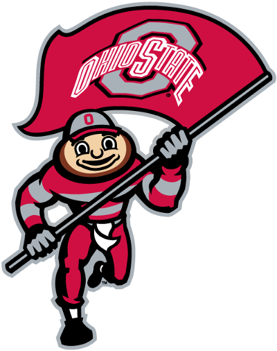
No matter which quality these logos have, one thing they all have in common is that people remember them.
I think UNLV tried to do a little too much with attempting to make the logo simple with the new sleek design, but almost made it complicated in the process with the symbolic features.
Additionally, UNLV stripped away some of the personality of the previous animated logo with the oversized mustache.
The logo could have been successful with incorporating the area they are located in if it was not so deep. The average person will not pick up on the Las Vegas features that are present in the logo’s design.
Some organizations go bigger than others, depending on what their situation is, but generally speaking, these traits can help to design a successful logo. Either the logo is so comically bad that it’s good, or it is just flat out good. UNLV is lost somewhere in between with their latest — a place no logo wants to be.
Front Office Sports is a leading multi-platform publication and industry resource that covers the intersection of business and sports.
Want to learn more, or have a story featured about you or your organization? Contact us today.
![Dec 22, 2024; Orlando, Florida, [USA]; Tiger Woods son Charlie Woods and daughter Sam Woods look on during the PNC Championship at The Ritz-Carlton Golf Club.](https://frontofficesports.com/wp-content/uploads/2025/01/USATSI_25050318_168392832_lowres-scaled.jpg?quality=100&w=1024)
