Why our new look is more than just a look.

Starting today, the old round logo with the briefcase, the baseball, the football, and the basketball will become part of our past, serving as inspiration for what we have done, and what we aim to become.
In its place, we bring to the table a new look just over six months in the making, and one we believe represents the ethos of our brand, and most importantly, the ethos of the community of professionals that have allowed us to have some success while getting to this point.
The Past
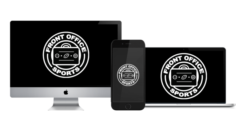
Anchoring our brand for the last three years was our black and white circle with big bubbly letters, and a nod to the intersection of sports and business with the briefcase and ball mix.
As we grew up, it helped us shape an identity in the industry as well as unique color scheme that no one else was using. When designing it with my friend Andrew, I asked for clean, recognizable, and different. He delivered on all three.
It will be tough to say goodbye to a mark that was synonymous with setting the tone in how we would engage on social media, how we would make our content insightful and fresh, and how we would build a community around the brand that we now cherish.
It’s amazing how far a logo that cost $40 dollars to design can take you, but oftentimes it’s not solely about what the logo looks like, and more about what it stands for.
The Making of Our New Logo
After three years of the old logo, we felt it was time for us to make a change. A change that people could see and feel as part of our evolution as a brand.
We reached out to numerous professionals, sent surveys, and talked to our trusted close connections to get the answer to one question, “What does FOS mean to you?”
As those answers came in, we started to notice a trend, a trend that made it clear in the way we wanted to approach this.
The trend told us that most, if not everyone, saw FOS as a community over anything else.
Armed with that feedback, as well as some other things we had noticed, we got in touch with Centerfold Agency and told them that we were looking for a logo that paid homage to our old one, provided us with a crisp and professional feel and approach, and that created a deeper sense of community.
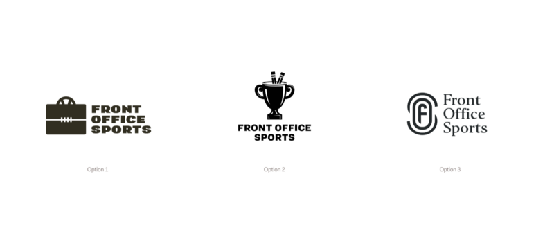
The first round of designs came with the above, as we both tried to feel each other out and see where we wanted this to go.
After round one, we settled on option three as the one we wanted to explore further. There was something about it, something that made us say, this could be it.
So, for round two, Centerfold presented us with the logo we have today alongside different font styles.
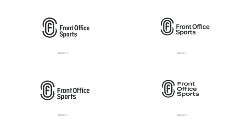
Whether it was something about the font styles or just being afraid of commitment so quickly, we turned down all of these options and asked Centerfold to give us a few more icon options to make sure we were certain with our choice going forward.
So, for round three, they took our feedback and came back to us with the following new icons.
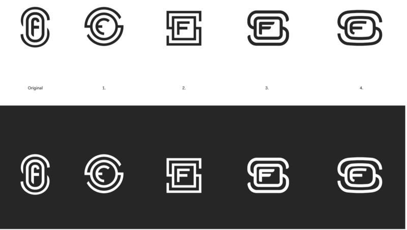
We asked them to push the limit and they did. From a cryptocurrency looking mark, to ones that exude almost a motorsports feel, they gave us five different and unique options, but we still gravitated and found ourselves liking option one.
After the third and final round, we all huddled to make a choice. Were we going to go with one that was completely abstract and out of left field, or the one that we had been drawn to since the beginning because of what it represented in our mind.
As you can see, we went with the latter and we are so happy we did.
The Present and the Future
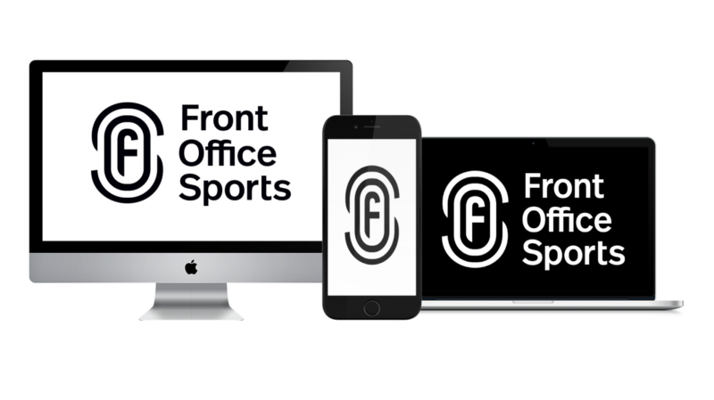
As we now head into the second half of our third year in business, we move forward with a new logo and typeface that we believe combines the best of our old logo, with the best of the feedback we received.
So, what does each aspect of the logo mean and why did we choose it to look as such?
Here’s why:
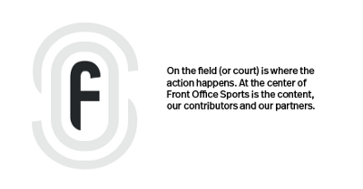
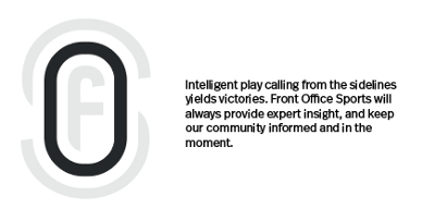
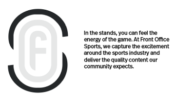
Beyond just being a cool logo (in our opinion at least), we wanted there to be a true meaning behind it and one that our audience can understand as soon as they see it, or read this.
Pushing forward through 2018, this new logo will set the standard for Front Office Sports as well as guide us when it comes to our new mission and vision statements.
Mission Statement:
To inspire collaborative and community-driven professional, personal, and industry-wide development.
Vision Statement:
To use impactful storytelling and content creation to empower and transform the sports business industry.
Front Office Sports has already exceeded what we wanted it to be and we can’t wait to see what comes next.
To all those who have been with us through the ups and downs, the shift from Wix, to Squarespace, to Medium and now to Wordpress sometime this month, we can’t thank you enough for enjoying what we do, how we do it, and why we do it.
We look forward to continuing to serve you with the best content, insight and commentary possible, and as always, if there is anything we can do to make it better, drop us a line at info@frntofficesport.com (yeah, we are getting rid of the .org too).
From one #FOSquad member to the next, thank you!
— Adam White
Founder and CEO

