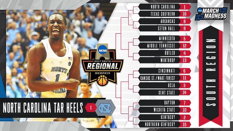
The best time of year is finally here! March Madness is ready to kick-off this week, and we’ve got you covered here at Front Office Sports with some bracketology of our own — the NCAA Tournament, social media edition!
We’ve already covered the East Region and Midwest Region. Today, we cover the South Region’s first round matchups on digital. Let’s get started!
1) North Carolina vs. 16) Texas Southern
Most all-time #GetIntoIt #SelectionSunday pic.twitter.com/PVEy5Bm6gx
— Carolina Basketball (@UNC_Basketball) March 12, 2017
The #RoadToTheFinalFour starts here #MarchMadness #BeatUNC #SWACChamps #TigerNation pic.twitter.com/O7cWVw7KQI
— Texas Southern University (TSU) Athletics (@TXSOTigers) March 13, 2017
UNC is no stranger to the Big Dance, as they’ve earned a number 1 seed a record number of times. The digital team designed a beautiful graphic highlighting these years, paying respect to the program’s storied history. I love the layout of the information, and the Carolina blue is rightfully a staple. Although there’s no matchup information, this simply looks fantastic.
Texas Southern’s matchup graphic is nicely done, with enlarged logos for each team and all of the information contained below. The black background offers a solid contrast with the white text and images, making for a sharp look.
Winner: North Carolina
8) Arkansas vs. 9) Seton Hall
Who's joining us in Greenville?!#SelectionSunday pic.twitter.com/J9ofck81Zg
— Arkansas Razorbacks Men’s Basketball 🐗 (@RazorbackMBB) March 12, 2017
Friday vs. Arkansas in Greenville it is! #marchmadness #HALLin pic.twitter.com/Hxcb7ZTqq7
— Seton Hall Men's Basketball (@SetonHallMBB) March 12, 2017
Although it wasn’t the initial post, the moving video GIF that Arkansas shared minutes after on Selection Sunday was extremely well done. I love the concept of ‘penciling’ the team into the bracket, which also highlights the context of the region. The Razorback red is in full effect, sticking with the Arkansas brand. Really cool work from the creative team.
Want more great content like this? Be sure to subscribe to our newsletter!
I like Seton Hall’s images of togetherness, showing a united program ready to play in the NCAA Tournament. The blue looks good as a background color, layered with the team photo, and having a celebration image front and center is a good visual representation.
Winner: Arkansas
5) Minnesota vs. 12) Middle Tennessee
#Gophers are headed to Milwaukee this Thursday to take on Middle Tennessee! pic.twitter.com/YGSwwZvw4W
— Minnesota Men's Basketball (@GopherMBB) March 12, 2017
.@MT_MBB to face Minnesota in Milwaukee, Wisconsin on Thursday, March 16! #BlueRaiders pic.twitter.com/ZMelv7wdla
— Middle Tennessee Athletics (@MTAthletics) March 12, 2017
I like the matchup card design by the Gophers’ social media team because it takes a simple template and presents it as a much more refined product. The color scheme is highlighted, but not over the top. I like the filter design on the edges, which adds a window-like vantage point perspective of the city.
Middle Tennessee also went with a filtered image; their background of choice capturing the pure joy of the players making the tournament. The blue compliments the design on top and bottom, and I like the incorporation of social media handles at the top. Always continue building the brand!
Winner: Minnesota
4) Butler vs. 13) Winthrop
There it is… pic.twitter.com/OldxIhgwx3
— Butler Basketball (@ButlerMBB) March 12, 2017
Here we come Milwaukee! 13 seed Winthrop takes on 4 seed Butler #W1NTHROP pic.twitter.com/fJzdZJWoJy
— Winthrop Athletics (@WUEagles) March 12, 2017
There’s nothing about Butler’s design that will ‘wow’ you, but it is a strong example of less is more. The graphic’s simple layout of information is efficient and to-the-point. In a moment that’s all about the program, it does well to compliment the excitement and message without overdoing it. Clean work by the Bulldogs.
Winthrop went with the classic CBS bracket screen capture, which does well to validate the moment and recognize national TV attention. In the end, the lack of a graphic pushes Butler over Winthrop.
Winner: Butler
6) Cincinnati vs. 11) Kansas State / Wake Forest
WE DANCE CINCINNATI!
The #Bearcats are the No. 6 seed and will face the winner of Kansas State/Wake Forest in Sacramento, California pic.twitter.com/ZLK21boCAq
— Cincinnati Bearcats (@GoBEARCATS) March 12, 2017
TICKET PUNCHED! #KStateMBB is headed to #MarchMadness for the 29th time in school history! 😼🏀 pic.twitter.com/wyXHdOBCuh
— K-State Men's Basketball (@KStateMBB) March 12, 2017
#LetsDance The Deacs are in the field of 68. Off to Dayton to play Kansas State in the First Four. #selectionsunday pic.twitter.com/EahWBmgXuZ
— Wake Forest Men's Basketball (@WakeMBB) March 12, 2017
This 6–11 matchup brings some strong content to the court, as all 3 teams challenged hard with clean designs.
I absolutely love the Bearcats’ design work, especially with the entire team assembled, superhero style. The black offers a sharp contrast to the text and image, and the wording is bold. The red jerseys inside the numbers is a really neat touch by the digital team.
Not to be outdone, Kansas State’s ‘Ticket Punched’ graphic is simple, bold, and distinctly purple. The faded filter offers a cool layer to the design, and I love how the panels containing the letters are differentiated.
Lastly, the Deacs went with the picture and text overlay format, which they were able to pull off nicely. It’s a perfect capture of emotion, although I would’ve liked some matchup information (to be fair, it IS mentioned in the post).
At the end of the day, the other two designs were just stronger than Wake Forest, and Cincinnati’s poster-like presentation JUST squeaks by the Wildcats.
Winner: Cincinnati over Kansas State
3) UCLA vs. 14) Kent State
The Bruins are TOURNAMENT BOUND!
No. 3-seed UCLA (29-4) will open against No. 14-seed Kent State (22-13) in Sacramento.#MarchMadness pic.twitter.com/n6gcKPntx7
— UCLA Men’s Basketball (@UCLAMBB) March 12, 2017
How about a trip out west? No. 14 @KentStMBB vs No. 3 UCLA, "South" Regional at the brand new Golden Center, Friday in Sacramento! #Unleash pic.twitter.com/ngS1uPtvuR
— Kent State Men's Basketball (@KentStMBB) March 12, 2017
The Bruins are excited to be tourney-bound after a strong season in the Pac-12. The social team put the group huddle photo to good use and it looks nice oriented on the side of text. However, the formatting of information, font, and presentation leaves a little to be desired. The design falls flat in producing a ‘wow’ that’s typically associated with a big-time program.
Kent State’s design is simple but super effective in its execution. The logos are big and bold, front and center, as are the seeds and the region. The information at the top goes well with the bottom half, and the ‘rip’ adds an interesting divide. I’m a big fan of the textured background as well — subdued but just the right amount of character and design. Nicely done!
The Golden Flashes pull off the upset and take down UCLA.
Winner: Kent State
7) Dayton vs. 10) Wichita State
— Dayton Basketball (@DaytonMBB) March 12, 2017
Shockers are headed to Indy! #watchus #SelectionSunday pic.twitter.com/WQUzFJkKvQ
— Go Shockers (@GoShockers) March 12, 2017
The Flyers are “flying” high to another NCAA Tournament, and the social team is working right along with them. Even though it contains no context to the matchup, I love the flickering “Let’s Dance’ sign as a graphic. It’s creative and different from other social content, which is a huge positive. To their credit, Dayton also followed this up with additional posts about matchup information.
Wichita State is no stranger to the Big Dance, “shocking” no one as they made yet another March Madness. The Shockers went with the simple matchup approach — clear and concise while remaining vibrant and bold. The full image in the background definitely works without clashing with the content. Overall, a very clean design!
In a toss-up, Dayton takes flight and narrowly edges Wichita State.
Winner: Dayton
2) Kentucky vs. 15) Northern Kentucky
#LetsDance pic.twitter.com/rJ8qomzQ5D
— Kentucky Men’s Basketball (@KentuckyMBB) March 12, 2017
It's official. @NKUNorseMBB learns it is the No. 15 seed and will face No. 2 Kentucky in Indy on Friday. #NorseUp #OnTheRise pic.twitter.com/GnaRUnHoEU
— Northern Kentucky Athletics (@NKUNorse) March 12, 2017
Kentucky’s graphic is everything you would come to expect from a traditional powerhouse program. It has all of the elements: the Wildcat blue color scheme, big bold lettering, matchup information, and artful presentation. The end result? A sharp, high quality looking design that is as good as any we saw on Selection Sunday.
The Norse of Northern Kentucky are hoping to make some noise in the NCAA Tournament, and the excitement surrounding the program is understandably high. Even taking the traditional approach of capturing the celebration works well for NKU.
Winner: Kentucky

