By Meaghan McCloskey, @Meaghan_Mc3 and Kelsey Smith, @14Smith15

In honor of baseball season starting again, we decided to take a look at our top ten caps for Double-A teams this week. Click here to see our rankings for single-A. Triple-A will be next week, followed by our top ten list for all of Minor League Baseball. Follow along throughout the month and let us know what your favorite minor league caps are!
Want more great content like this? Be sure to subscribe to our newsletter!
If you see a hat you need to add to your collection, click on the image and it’ll take you to the online team store!
All photos are from the team websites.
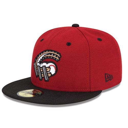
10. Altoona Curve: This hat is really clever because there are multiple ways the team name is tied in. First, you have the railroad tracks curve with the ball acting as a train. You also have the ball curving that it can be a play on the curveball. (Meaghan)
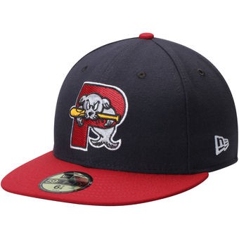
Portland Sea Dogs: The color scheme stays true to Portland’s major league affiliate, Boston, which is great. I like the letter “P” being at the forefront of their branding scheme, with the sea dog wiggling through while holding a bat in its mouth. (Kelsey)
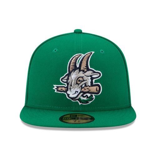
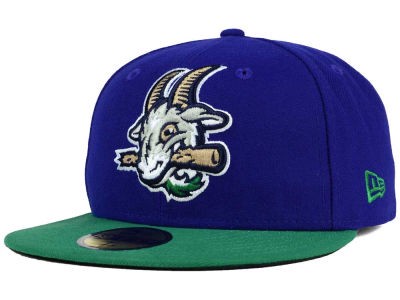
9. Hartford Yard Goats: This hat kind of makes me giggle because the mascot is a goat. It’s not something you’d expect. I like how the goat is chomping down on a bat, too. (Meaghan)
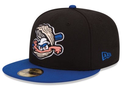
Biloxi Shuckers: A shucker is the shell of an oyster, and Biloxi makes them look mean with this cap. I also like how the blue of the bat matches the blue bill of the hat. It really pulls it all together. (Kelsey)
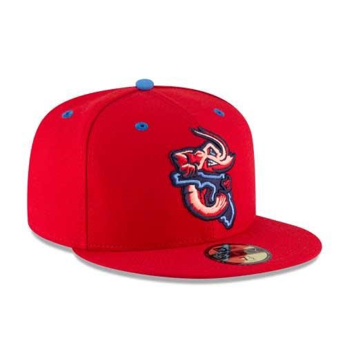
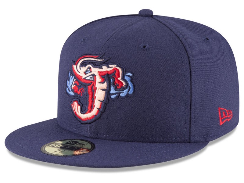
8. Jacksonville Jumbo Shrimp: Jacksonville did a nice job of making their jumbo shrimp look jumbo by having it hold Florida. The red/pink/blue color combo looks good, too. (Meaghan)
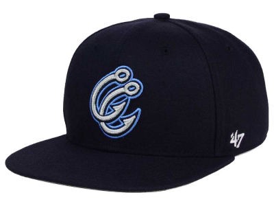
Corpus Christi Hooks: I think this is a really creative logo for Corpus Christi. Its two hooks rounded in the shape of two “C’s.” It’s cool how they put them on top of each other instead of side-by-side. It adds a little bit more creativity. (Kelsey)

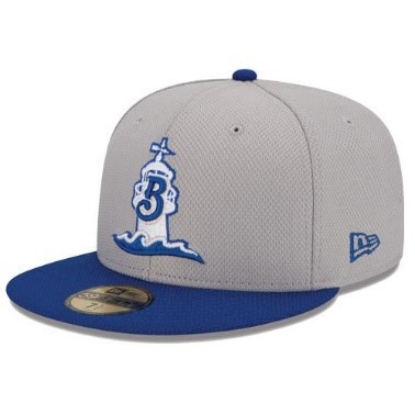
7. Biloxi Shuckers: I love lighthouses, so I love that Biloxi has one on their hat. The cursive letter ‘B’ works perfectly with the waves, too. (Meaghan)
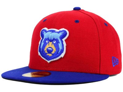
Tennessee Smokies: Another team that sticks with its parent team’s colors. It’s obvious that the Smokies are an affiliate of the Chicago Cubs with the red and blue cap and the bear. The bear being blue gives it an extra dimension and the fact that it’s a lighter blue seems to pay tribute to the flag of Chicago. (Kelsey)
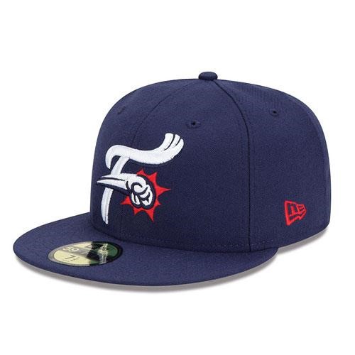
6. Reading Fightin’ Phils: For as simple as this hat is, it really packs a punch. I like that they didn’t use a mascot to show the fightin’ part, but instead incorporated it with the letter ‘F.’ (Meaghan)
Jacksonville Jumbo Shrimp: This is a Brandiose design as the Jumbo Shrimp were completely rebranded this offseason. The cap features one of the many cool logos that Jacksonville now has. I like how they made a shrimp of all animals look tough. (Kelsey)
5. Corpus Christi Hooks: I love that the hooks on this hat make C’s for ‘Corpus Christi.’ It’s a really clever way to connect the city with the team moniker. (Meaghan)
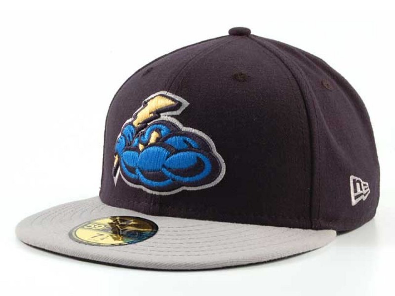
Trenton Thunder: An extremely creative concept comes from the Trenton Thunder. It may look like a blue blob at first, but when you look closer, you can tell that it’s a storm cloud. Not only that, but it is holding a lightning bolt as if it’s a bat. (Kelsey)
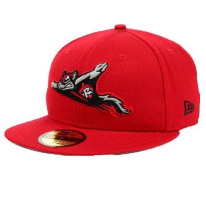
4. Richmond Flying Squirrels: This hat believed it could fly. It believed it could touch the sky. The flying squirrel looks awesome on the red background and really looks like it’s coming at you. (Meaghan)
Hartford Yard Goats: Another Brandiose design makes the top ten. The green and blue color scheme fits right in with the goat. It looks like the goat is chomping on the top end of a baseball bat with his teeth too. (Kelsey)
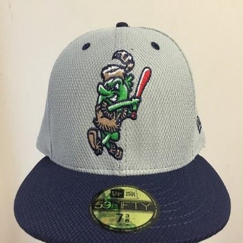
3. San Antonio Missions: The mascot featured on this Missions hat is Ballapeño, and he’s definitely jalapeño business. I love that the Missions feature him on a hat, as he is my new favorite mascot. (Meaghan)
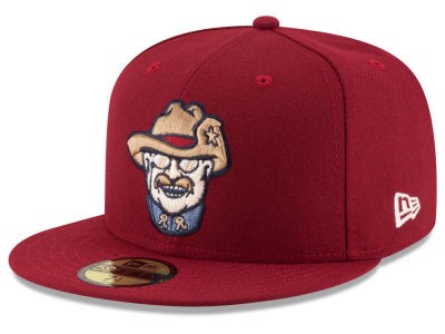
Frisco RoughRiders: Sometimes you have to put a former president on your cap to send the message. Teddy Roosevelt is the only president (to my recollection) that is part of a branding scheme for a sports team. It’s a really simple design but looks so sharp, while going back into American history. (Kelsey)
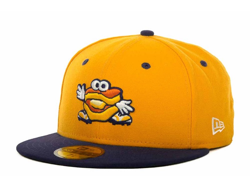
2. Montgomery Biscuits: This hat perfectly embodies minor league baseball. This is one of the goofier mascots, but that’s what makes the minors leagues so fun. You can currently pre-order a hat that looks like their mascot, which would’ve been my number one choice if available, and I think that’s the coolest thing ever. (Meaghan)
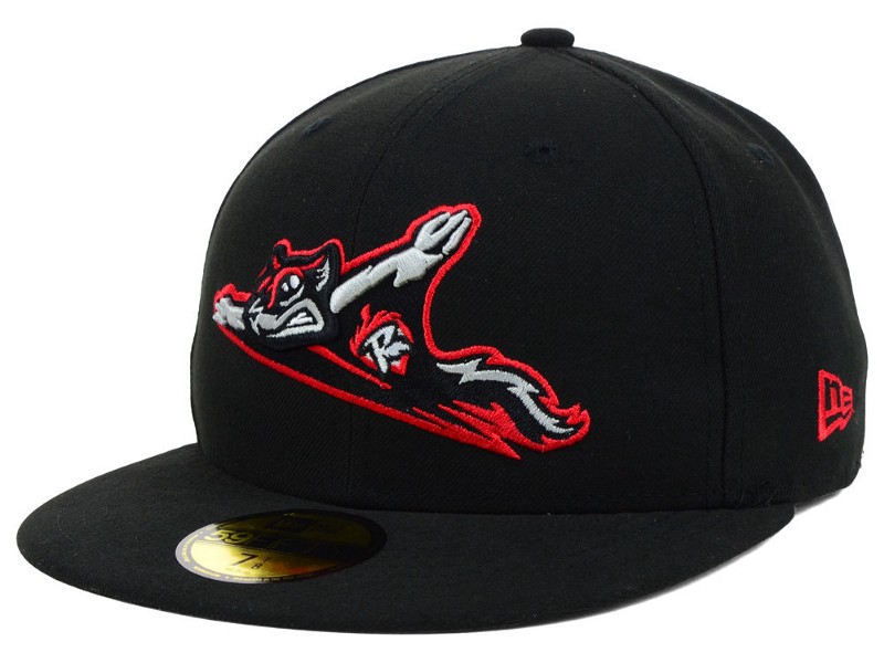
Richmond Flying Squirrels: The red and black color scheme looks great and I like how the squirrel is extremely big on the front of the hat. My favorite part about it is the little “R” on his chest. (Kelsey)
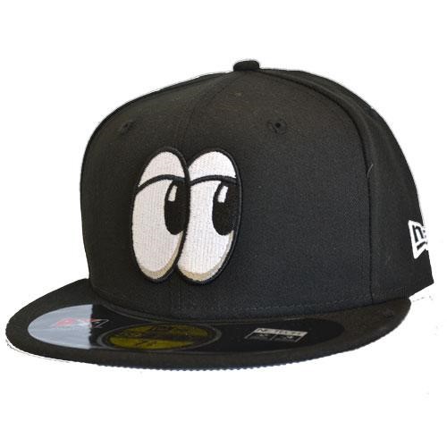
1. Chattanooga Lookouts: I. Love. This. Hat. Using the popular eyes emoji is brilliant. Opposing teams beware, Chattanooga has an extra set of eyes on you. (Meaghan)
Montgomery Biscuits: This hat is honestly on my birthday list because there’s nothing like it in all of sports. The color concept plus the little biscuit logo just gets it done. Well done Montgomery! (Kelsey)


